
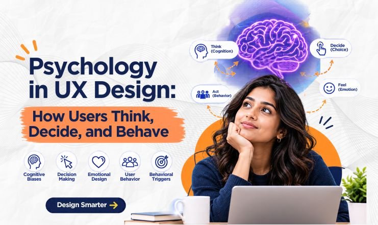
Psychology in UX Design: How Users Think, Decide, and Behave
Web D School | Expert Economy
UX design is not only about screens, flows, or visual hierarchy. It also depends on how people perceive information, use memory, make choices, form expectations, and respond to feedback.
Understanding these patterns helps designers reduce unnecessary effort and make interfaces easier to understand. Learning how UX principles are applied in real-world UI/UX design through a ui ux designer course in Chennai helps aspiring designers understand user behaviour and create products that balance user needs with broader product goals.
But psychological knowledge is not automatically good design. The same principles that can simplify a task can also be used to pressure, confuse, or trap users. The practical skill is knowing both how a principle works and where its ethical boundary lies.
Quick Answer
Psychology in UX design helps designers anticipate how users perceive, decide, remember, and act. Useful principles include mental models, cognitive load, recognition over recall, feedback, consistency, and visual grouping.
UX laws are best treated as lenses for design decisions—not rigid rules or proof that a solution is correct.
1. Mental Models Shape What Users Expect
Users rarely approach a new interface without prior expectations. Their experiences with other websites, apps, and everyday objects shape how they interpret a product and predict how it will behave.
When an interface follows familiar conventions, users can rely on what they already know instead of learning every interaction from scratch. A shopping cart that works as expected or a back button that returns users to the previous screen makes navigation more predictable and reduces unnecessary effort.
This is the principle behind Jakob’s Law: users generally expect digital products to work in ways similar to products they already know. Understanding how familiar design patterns shape user expectations helps designers make interfaces easier to learn and use.
However, familiarity should guide design decisions, not limit them. Copying an established pattern without considering the product’s context can create its own usability problems. The goal is to preserve familiar interactions where they help users while introducing new ones when they offer a clear, meaningful benefit.
2. Cognitive Load Changes How Much Users Have to Think
Working memory is limited, so every additional choice, instruction, or competing visual element can increase the mental effort required to complete a task.
When a screen gives equal prominence to too many elements, users must work harder to identify what matters. Clear visual hierarchy, meaningful grouping, and concise instructions help reduce this unnecessary effort and make the next step easier to recognise.
The same principle applies to decision-making. Hick’s Law explains how the number and complexity of available choices affect the time needed to make a decision. Understanding how the number of choices influences decision-making helps designers organise menus and prioritise relevant options without removing choices users genuinely need.
Once users have decided what to do, the interface should make the action easy to perform. Fitts’s Law describes how target size and distance influence the time needed to reach a control. Applying Fitts’s Law to button size and placement helps designers make important actions easier to select, particularly on touchscreens.
The goal is not to eliminate every choice or simplify every interaction. It is to reduce unnecessary effort while preserving the decisions users need to make and giving them clear, accessible ways to act.
3. Affordances, Signifiers, and Feedback Tell Users What to Do
An interface should make it clear both what users can do and what happens when they act. Three concepts help explain how this works: affordances, signifiers, and feedback.
An affordance describes an action that an interface makes possible, while a signifier helps users recognise where or how to perform that action. A button’s appearance, a descriptive label, or a familiar icon can communicate that an element is interactive. Clear visual cues that help users recognise interactive elements make actions easier to discover without relying on instructions.
Discovering an action is only the beginning. Users also need to know whether the system has responded. When someone submits a form or taps a button and nothing visibly changes, they may wonder whether the action worked. A loading indicator, confirmation message, or clear status update communicates what is happening. Effective status feedback that keeps users informed reduces uncertainty and helps users understand the system’s current state.
These concepts work alongside other core UX principles, including consistency, visibility, and error prevention and recovery. Together, they help users understand available actions, anticipate outcomes, and recover when something goes wrong.
A useful design question is simple:
After every important action, can users understand what happened and what to do next?
If the answer is no, users may be left guessing whether their action worked, whether they need to wait, or how to proceed.
4. Recognition Usually Beats Recall
Recognition over recall means showing users useful information when possible instead of forcing them to remember it from an earlier step.
A list of recent addresses, visible filter options, or suggested search terms gives users cues they can recognise rather than information they must reconstruct from memory.
The principle of recognition over recall in UX design encourages designers to make relevant options visible and easy to identify, reducing the effort required to retrieve information from memory.
However, this does not mean every option should be visible at all times. Too much visible information creates clutter and can increase cognitive load.
The better rule is to expose the information users are likely to need at the moment they need it. Recognition over recall is a design preference, not an absolute rule; the right balance depends on the task, the context, and the information users need to complete it.
5. Visual Grouping Helps Users Understand Relationships
People do not interpret interface elements independently. They naturally look for relationships between things that are close together, visually similar, or contained within the same region.
That is why grouping is more than a visual styling choice. It helps users understand which elements belong together and how information is organised.
- Proximity can show which label belongs to which control.
- Similarity can signal that several elements perform related functions.
- Common region can make a set of items feel like one group.
These patterns reflect how Gestalt principles help users interpret visual relationships, allowing designers to organise interface elements into meaningful groups.
In practice, ask whether the visual structure communicates the same relationships you intend.
If two elements look related but serve different purposes, users may interpret the interface incorrectly. Consistent spacing, purposeful visual similarities, and clear grouping help prevent that confusion.
6. Memory and Endings Influence How Experiences Are Remembered
Memory and attention are selective rather than evenly distributed. Several UX laws explore this idea, including Miller’s Law, the Serial Position Effect, the Von Restorff Effect, and the Peak-End Rule.
Miller’s 1956 research examined limits in information processing, but it is often misinterpreted as a rule that menus should contain no more than seven items. Reading Miller’s original research on memory and information processing helps clarify why the number seven should not be treated as a universal limit for interface design.
The Peak-End Rule offers another useful perspective. It suggests that people’s retrospective evaluations of an experience can be influenced disproportionately by its most intense moment and its ending. Research on how the most intense and final moments shape remembered experiences helps explain why these moments can carry particular weight in memory.
For UX, this suggests paying attention to moments such as task completion, confirmation, and error recovery—not just the average experience. A clear confirmation after a successful payment or helpful guidance after an error can make an important interaction easier to understand and leave users with a clearer sense of what happened.
7. The Same Psychology Can Help or Manipulate
Psychological principles can make interfaces easier to understand and use, but they can also influence users in ways that serve the business at their expense. The difference lies in how those principles are applied.
A genuine deadline communicates a real limit and helps users make a timely decision. A fake countdown creates artificial urgency, pressuring users to act before they have had time to consider their options.
The same distinction applies to friction. Confirming an irreversible action gives users a chance to prevent a serious mistake. Making cancellation unnecessarily difficult is an example of how difficult cancellation processes restrict user choice, creating barriers that primarily benefit the business rather than the user.
Research into how deceptive interface design can manipulate user choices highlights why designers must consider not only whether an interface changes behaviour, but also whether it respects users’ ability to make informed decisions.
When reviewing persuasive UI, ask two questions:
- Would users feel manipulated if they knew exactly why the interface was designed this way?
- Can they still make a clear, informed, and reversible choice?
If the answer to either question raises concerns, the design deserves another look. The problem is not that psychology influences behaviour; it is whether that influence helps users achieve their goals or exploits them for someone else’s benefit.
Conclusion
Psychology gives UX designers a set of lenses for understanding behaviour—not a collection of rules to memorise.
Mental models, cognitive load, feedback, recognition, visual grouping, and memory can all help make products clearer and easier to use.
The stronger practice is to apply these principles with context, test the resulting design, and keep the user’s control intact. A UX law can suggest what to investigate; it cannot prove that a design is correct.
For aspiring designers, developing these skills through a ui ux designer course in Chennai can provide a foundation for applying psychological principles, making ethical design decisions, and creating user-centred digital experiences.
6. FAQ
1. What is psychology in UX design?
Psychology in UX design is the application of knowledge about perception, memory, attention, decision-making, and behaviour to interface and product decisions. It helps designers anticipate where users may experience confusion, unnecessary effort, or uncertainty and design interactions that better match human expectations.
2. Why is psychology important in UX design?
Psychology helps explain why users respond differently to choices, layouts, feedback, familiarity, and information. Designers can use those insights to reduce cognitive effort, make actions easier to understand, support memory, and create more predictable experiences.
3. What are the most important psychological principles in UX?
Important principles include mental models, cognitive load, recognition over recall, feedback, consistency, affordances and signifiers, visual grouping, and principles related to memory and attention. The source recommends treating these as practical lenses rather than isolated rules to memorise.
4. What is cognitive load in UX design?
Cognitive load refers to the mental effort required to understand information or complete a task. In UX, excessive choices, competing visual elements, unclear instructions, and unnecessary steps can increase that effort. Good design reduces avoidable mental work without removing decisions that genuinely belong to the user.
5. What is recognition over recall in UX?
Recognition over recall means making relevant information visible so users can identify what they need instead of remembering it from scratch. For example, recent searches, suggested search terms, and visible filter options help users recognise available choices rather than retrieve details from memory. The distinction between recognition and recall in interface design helps explain why providing familiar cues can make everyday interactions easier.
6. Are UX laws actual rules?
No. UX laws are better treated as evidence-informed heuristics or lenses. The source specifically warns that naming a law does not prove a design decision is correct. Context, user research, and evaluation still determine whether a design actually works.
7. What is the difference between ethical UX and dark patterns?
Ethical UX uses psychological principles to help users understand, decide, and act. Dark patterns use interface techniques to obscure, pressure, or manipulate user choices. Examples include fake urgency, difficult cancellation, hidden costs, and misleading defaults.