
We know what UX design is and what UI design is. So essentially, we know what these designers do. UX designers identify problems and come up with solutions. UI designers create interfaces that are appealing and aesthetic. But what is the potential that lies with them? What is expected of them? What are they materially capable of doing? Let’s see some examples of how designers put businesses on the map with their skills.
1.Airbnb
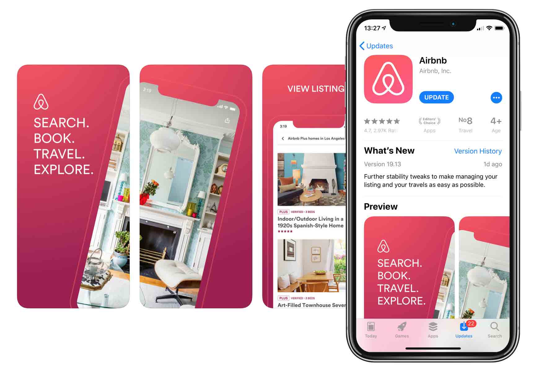 Airbnb has been known for its UX design moves, and we will discuss two of its significant actions. The organization curates lodging options for travelers.
When the founders launched the service in the initial stages, the team tried to drive more traffic to book from their site. Their research made them realize that most of the owners had posted unclear and amateur photographs of their places, while the users often booked the few with well-photographed profiles.
They wondered how to solve this problem, and they found that most owners neither owned professional cameras nor had an aesthetic sense. They soon decided that the organization had to photograph the places listed. A team was hired to visit the listed sites and take quality pictures for the database.
The organization experienced a sharp rise in bookings following this effort.
They also designed the landing page of their website with great insight. The page was kept simple and uncluttered. A beautiful landscape picture decorates the background, with a simple search form in the foreground. The search form, too, was kept minimal. It only asks the visitor the area of their search, dates they will need a place on, and the number of guests they must accommodate.
The page also used the Z pattern to position its layout. Research says that people read in the Z pattern, i.e., from top left to top right and then to bottom left and bottom right. The landing page positioned the search form at the top left, one of the focal points. Within the search form as well, the Z pattern has been practiced. The Call-to-Action Button (in this case, a search button) is placed at the bottom right of the form. The focal points being properly utilized maximizes clarity and precision.
2.Uber
The ride-booking service has had some design problems early on, and here is how they dealt with some of them.
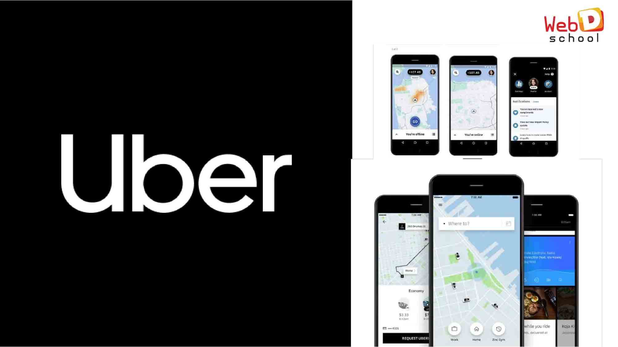
The UX research team collected data on the frequency of calls between the riders and drivers, and it served as a measure for time wasted in coordinating their respective locations. The app did not have a live location at the time, and there was usually a variation of up to 100m in the pickup location marked by the rider. This was because people often book their rides from inside some buildings, and the drivers would end up on the wrong sides of the buildings.
The designers enabled the concept of live location sharing (if consented to by the rider). This tweak saved a considerable amount of time that the riders and the drivers previously spent locating each other.
The drivers did not ask the destination at first in the early stages. The app would ask the pickup location to book a ride, which created delays in the app, suggesting the best possible routes. As a result, rides often took up a less than an optimal route.
The destination was asked first to fix this, and users could choose from recent and frequented destinations from suggestions. They could also save regular destinations. This lets the GPS take its time and develop the best possible route. This change also gave the riders an estimate of the ride fare upfront, which worked pretty well for the riders.
3.Netflix
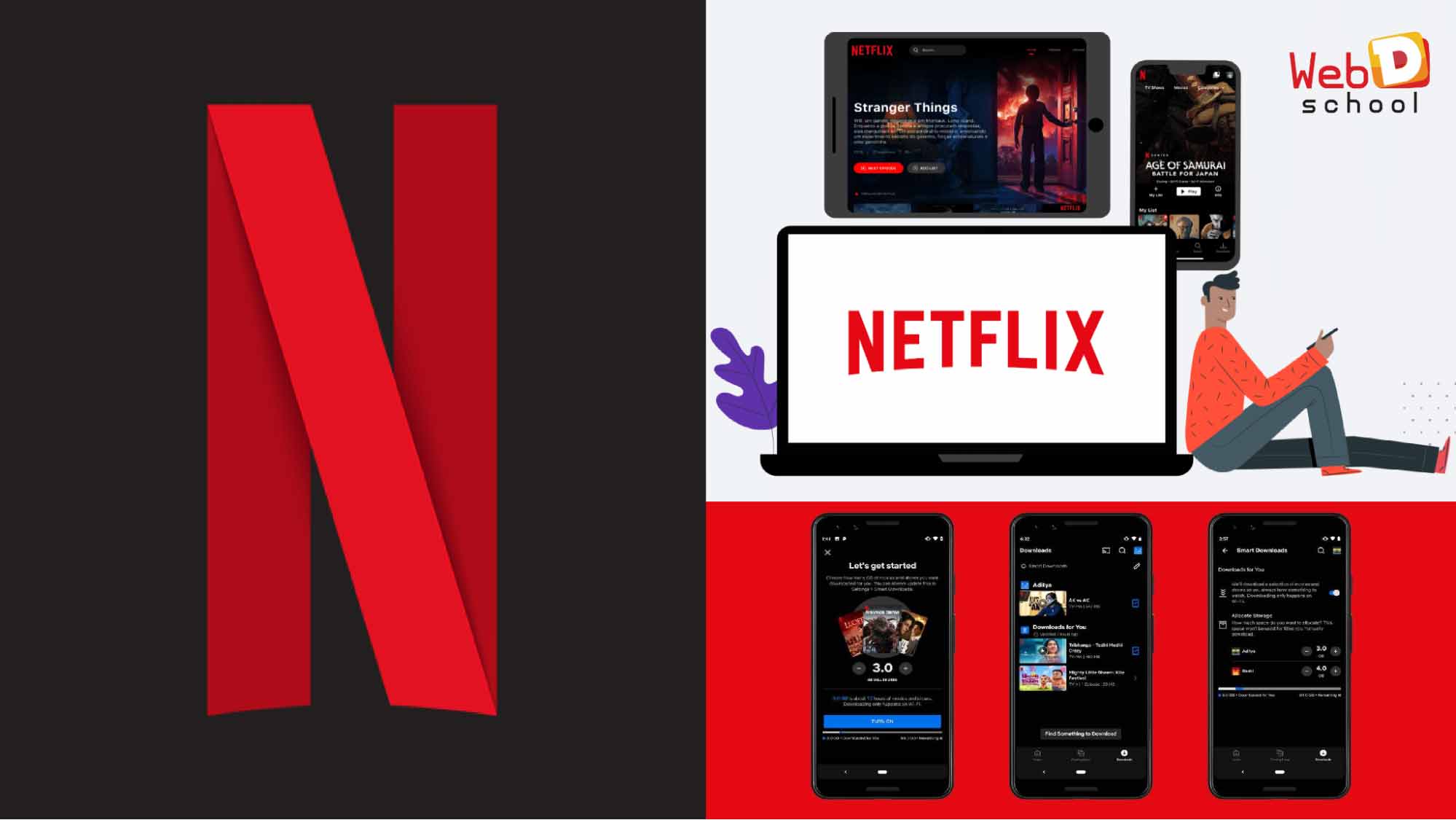
The evolution of Netflix is an excellent UX case study. The site was launched as a DVD renting e-commerce site, where the company mailed users a copy of DVDs that they ordered.
The site offered a streaming service with a play button next to the movie to reduce the waiting time and study audience responses closely. As this became popular and the site continued to get more traffic, they continuously studied their audience to improve the quality of the content they presented on their platform, which they couldn’t do earlier with the DVD rental service.
Netflix pays a lot of attention to choosing what they present on their platform. Algorithms were set to track user activity and identify what streams the most. It bombarded the audience with a vast collection of relevant media. But more importantly, it kept on fine-tuning its recommendations algorithm. With the massive collection of data on user activity, Netflix started producing its own shows and movies tailored for its user groups.
Netflix was one of the earliest brands to adopt the subscription model, emerging as a popular model among many businesses in the new millennium.
The preview clip that plays when you hover over the thumbnail of a particular show and the dark and bright color palette are some examples of the classy UI design of Netflix.
The Takeaway:

The Role of a UX designer is to find areas where one can save time, energy, money, and other resources. This includes the intellectual effort it takes for users to go through the process of consumption. A UX Design can become the one thing that differentiates businesses that shoot up to the moon and those that fall short.